
The Power of Saturated Colors: How Bold Hues Awaken the Spirit and Elevate the Mood by Percy Armando.
- Percy Rivera
- Feb 24
- 2 min read

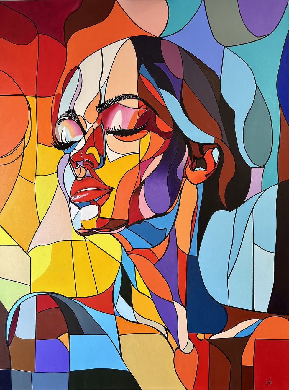
Color is more than a visual experience — it’s an emotional language. In art, saturated colors have a unique ability to bypass logic and speak directly to the spirit. They energize, uplift, provoke, and sometimes even heal. For artists like me, saturated hues aren’t just pigments on a palette; they’re emotional frequencies that shape how viewers feel the moment they encounter a piece.
Why Saturated Colors Hit Us So Deeply
Highly saturated colors carry intensity. They vibrate with life. When used intentionally, they can:
• Boost emotional energy
Bright reds, electric blues, and vivid yellows activate the senses and create a feeling of aliveness.
• Shift the viewer’s mood instantly
A saturated palette can transform a quiet room into a space that feels bold, expressive, and full of movement.
• Create a sense of presence
These colors demand attention. They pull the viewer into the artwork and hold them there.
• Awaken the subconscious
Saturated hues often evoke memories, sensations, or emotions that viewers can’t always explain — but they feel them deeply.

Color as a Spiritual Stimulus
Many cultures have long believed that color carries spiritual meaning. In contemporary art, saturated colors often serve as:
• Portals to emotion
They help viewers access feelings they may not express verbally.
• Symbols of transformation
Bold hues represent change, awakening, and inner movement.
• Tools for grounding or elevation
Deep blues can calm the mind, while radiant oranges and pinks can elevate the spirit.
When these colors appear in a painting, they don’t just decorate the canvas — they activate the viewer.
How I Use Saturated Colors in My Work
In my own paintings, saturated colors are a deliberate choice. I use them to:
• Create emotional contrast
A vivid color against a muted background becomes a heartbeat on the canvas.
• Express inner landscapes
Saturated hues help me translate complex emotions into visual form.
• Invite the viewer into a dreamlike state
When colors are intense, the world inside the painting feels more alive than reality.
My goal is always the same: to make the viewer feel something — instantly and deeply.

Why Viewers Connect With Bold Color
People are drawn to saturated colors because they reflect something we all crave: intensity, passion, and authenticity. In a world that often feels muted, bold color reminds us that we are still vibrant inside.
When someone stands in front of a painting filled with saturated hues, they’re not just looking at art — they’re reconnecting with their own emotional spectrum.
Final Thoughts
Saturated colors are more than aesthetic choices. They are emotional catalysts. They stimulate the spirit, elevate the mood, and create a powerful connection between the artwork and the viewer.
In my work, I use them as a bridge — a way to communicate energy, emotion, and inner truth without saying a single word.
If you’re drawn to bold color, it’s because your spirit recognizes itself in those hues.

$50
Product Title
Product Details goes here with the simple product description and more information can be seen by clicking the see more button. Product Details goes here with the simple product description and more information can be seen by clicking the see more button

$50
Product Title
Product Details goes here with the simple product description and more information can be seen by clicking the see more button. Product Details goes here with the simple product description and more information can be seen by clicking the see more button.
$50
Product Title
Product Details goes here with the simple product description and more information can be seen by clicking the see more button. Product Details goes here with the simple product description and more information can be seen by clicking the see more button.


Comments